Resume Refresh | 24 in 24
Dash 2 of 24 in 2024!
This one has been on my to-do list for a long time.
Back in 2021, I created my first Tableau Resume, and for quite some time now, it’s been hidden on my Tableau Public site because I didn’t think it represented what I liked about design or my skills in Tableau anymore. And since the whole point of a resume is to be showy about those things, it’s been banished.
So, for this blog, I will focus on what I didn’t like and the process I went through to upgrade this dash.

The Old Dash
The Good:
I think the skills section does an excellent job of summarizing my experience with different tools and professional abilities and how I analyze my strengths.
Ample space to show off accomplishments that don’t necessarily fit in a space for work experience or education.
The Bad:
Some text in the work experience and the accomplishments section is not wrapped correctly and is cut off.
The use of logos is not consistent in sizing.
The section for Hobbies does not provide much insight and is very basic (there is no hover for more details there, making it even more inconsistent because all the other circles do have that ability)
Other than the bar chart in the skills section, nothing about this takes advantage of the data viz aspect for resume building in Tableau
The Ugly:
What is this color palette? The green and blue are very out of place with the red and pink
Holy giant profile picture
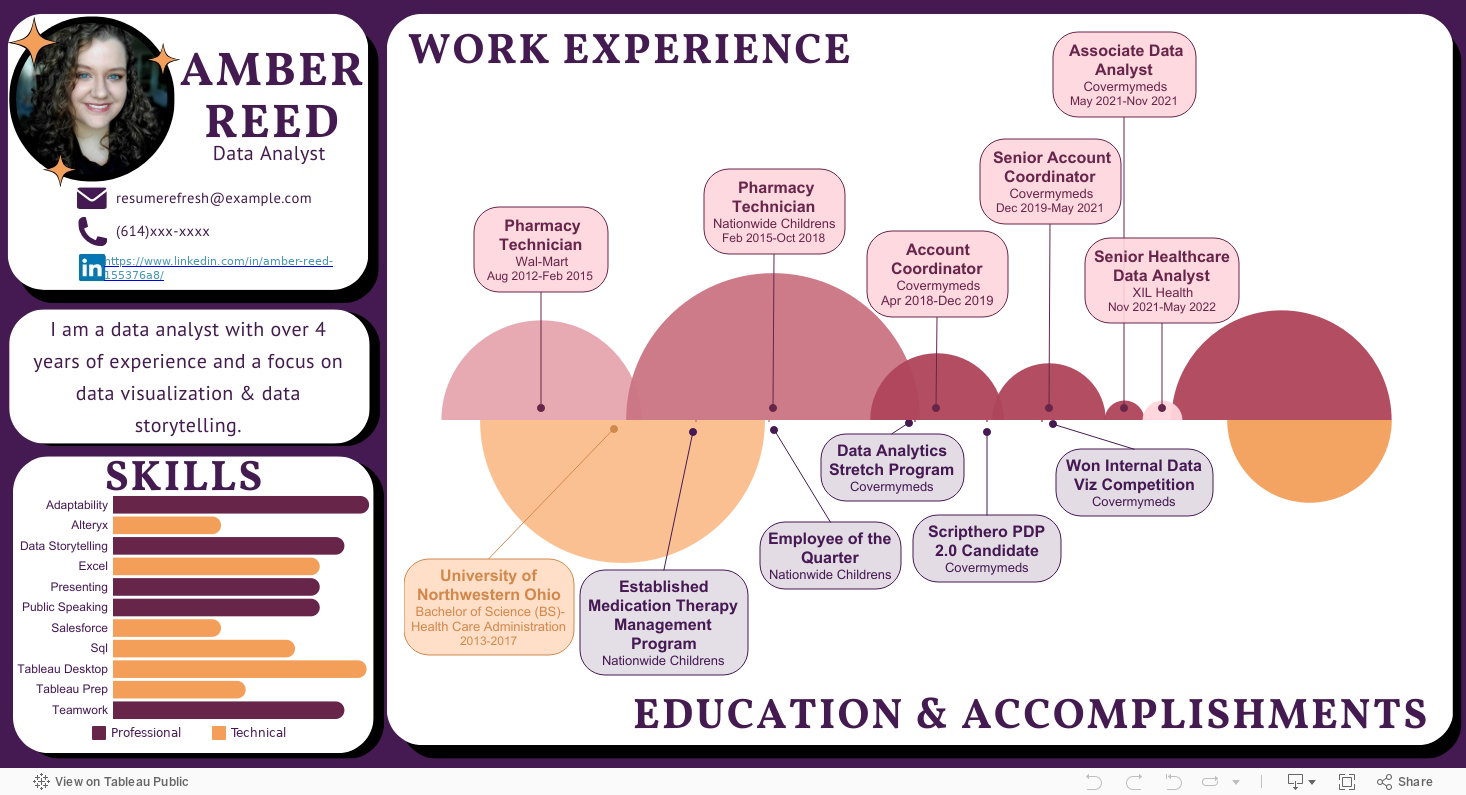
The New Dash
I knew for this dash, I wanted the focal point of it to be my work experience and education, like any resume, but I also wanted that element to be an actual data visualization. The obvious choice for something time-based, like a resume, is some timeline, and because I wanted to make a chart that I hadn’t made before, I decided to go with a Bubble Chart Timeline. I found a few blog resources to help me get there, but the one that helped the most was one from The Data School.
So, once I had the idea of what kind of visualization I wanted to use, I searched around for some design inspiration. I wanted to do something a little more fun than you can get away with doing on a traditional resume because traditional resumes are oh. so. boring. I went to Canva to look around and pulled together the following four as inspiration.

I was a fan of the big, bold RESUME of the primarily black one but decided it would take up too much space on the finished product. So, some of the things I decided to pull my inspiration from were the use of color, sections, rounded corners, and minimal use of graphics.

Next, I wanted to find my color palette.
One of my favorite websites to search around for color palettes is ColorHunt. It is a site full of curated color palettes put together by actual designers. I knew I wanted to go for darker, warmer vibes, so I chose the option for warm and ended up with the palette shown here!
Putting that altogether now, here is my finished product and another dashboard done for the year √