
Getting to d3.js: Advanced CSS
I’ve made it to the last of the CSS lessons, and the first thing I’m learning in this advanced section is CSS Displays.
The display property specifies the display behavior and the 3 types of displays covered were:
inline
displays the elements as inline, height and width will have no effect
inline-block
displays the elements in an inline block container, you can set the height and width
block
displays the element as a block container, each elements takes up the whole container and will take up the whole width

First challenge was to create a vertical display of 3 paragraph color elements
The solution for this was to use the block display, as it will result in each element taking up the width of the container—forcing new elements to the next line, creating a vertical list
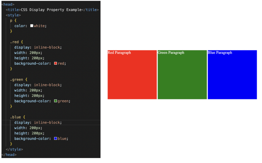
The next challenge was to create a horizontal display of the same 3 paragraph color elements.
This solution was to use the inline-block display, to allow each element to show up inline, but also keep the height and width specifications.
The next lesson is on CSS Float.
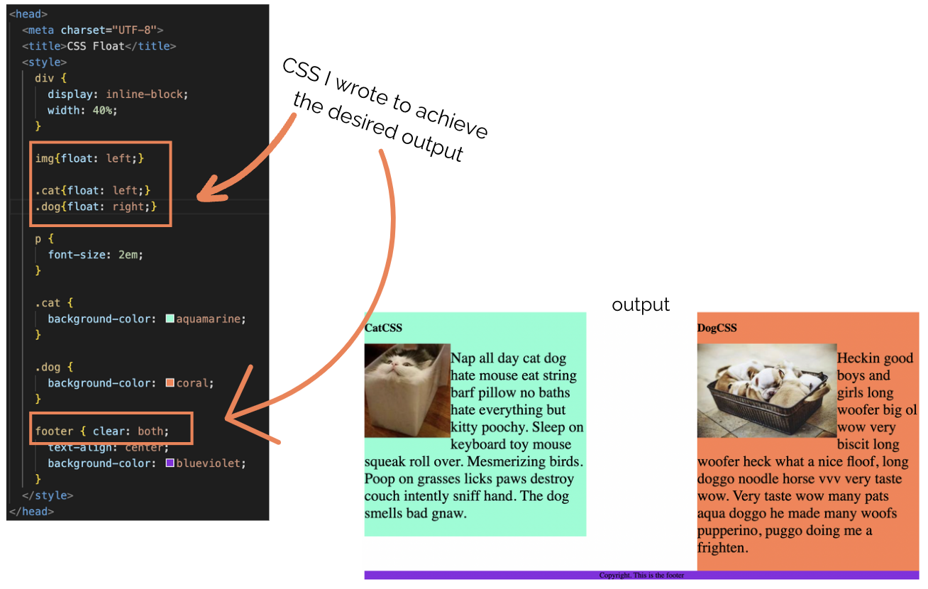
Float allows you to wrap elements around other elements. The most common use of this is to wrap a paragraph element around an image. To achieve this, you set float to the thing you want the other element to wrap around, so in this example, you would set float to the image, not the paragraph.
If you don’t want a specific element to float around another element that is set to float, you can use clear. Clear will “clear” that elements responsibility to wrap around floats.
My challenge below was to take some existing images, paragraphs and a footer and and make the text wrap around the images, align the paragraphs (one to the left and one to the right) and then clear the footer so it does not wrap and displays below the two paragraphs.
Final Project: Web Design Agency Website
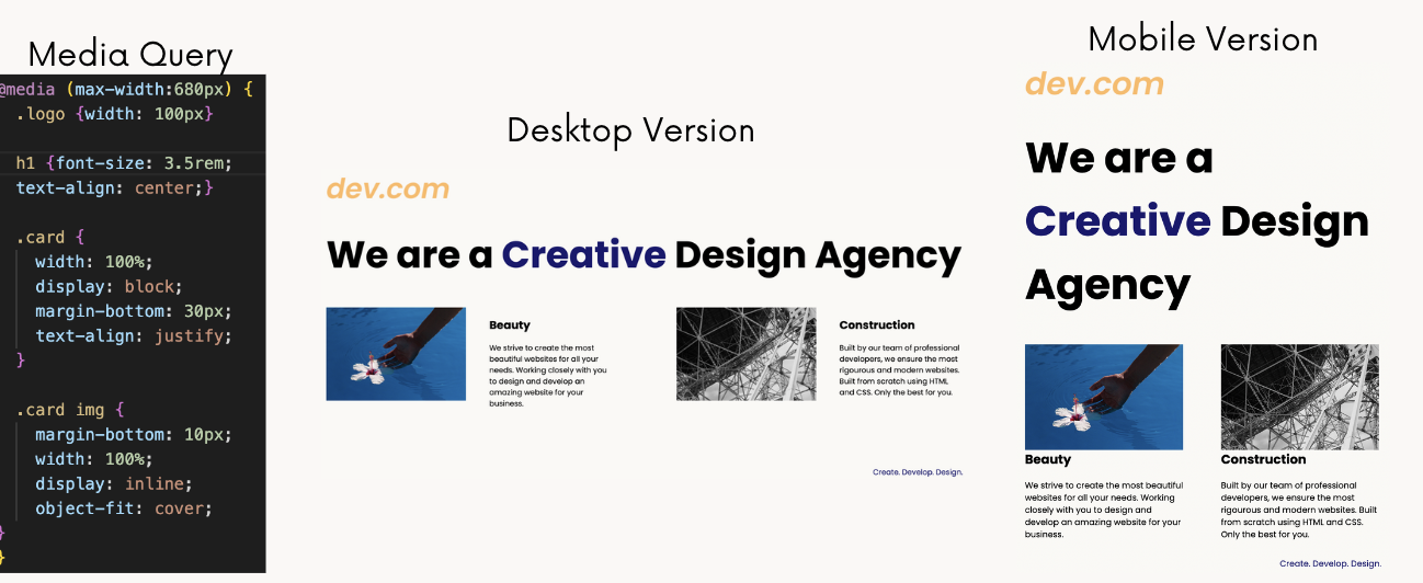
First, there was a quick lesson about using media queries to control the responsiveness of the website, but no challenge and straight into the final project, which was to build a responsive faux Web Design Agency Website. The goal was a simple website that looks good in both desktop and mobile widths. The following is the output for both and the media query I wrote to result in it!
And that concludes the CSS courses! Up next is learning more about layouts and responsiveness with Flexbox, Grid and Bootstrap.